White Quartz Countertops
If you’ve searched “white quartz countertops” and ended up scrolling through fifty different photos that all sort of look the same, you’re not alone. It’s one of the most common surprises our clients run into here at Masters Countertops: you go in thinking you want “white quartz,” and you realize there isn’t just one white quartz. There are dozens.
Some are bright and stark. Others are warm and soft. Some barely have any veining, and others look like they were lifted straight from an Italian marble quarry. The difference between them can completely change how your kitchen or bathroom feels and choosing the wrong one (or choosing based on a tiny sample chip) is one of the most common regrets we hear about after the fact.
So we pulled together 10 of our most popular white quartz shades to show you just how different “white” can really look, and to help you figure out which one actually fits your space.
Why “White” Quartz Is Never Just White
Before we get into the shades themselves, it helps to understand why two slabs that are both technically “white quartz” can look completely different sitting next to each other.
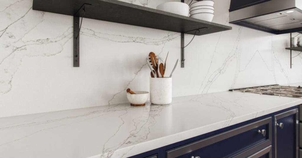
Three things drive that difference: the base tone (cool white, warm white, or somewhere in between), the veining (none, subtle, or dramatic), and how the slab reacts to light. A slab that looks bright and neutral under our showroom’s lighting can shift subtly warmer or cooler once it’s sitting under your kitchen’s LED lights or next to natural sunlight from a window. This is exactly why we always recommend seeing a full slab in person rather than relying on a photo or a small sample chip, patterns and undertones only really reveal themselves at scale.
With that in mind, here’s a closer look at 10 white quartz shades, from clean and minimal to richly veined.
10 White Quartz Shades, Side by Side
1. Glitter White
Glitter White is exactly what it sounds like — a clean white background filled with reflective, off-white flecks that catch the light as you move around the room. There’s no heavy veining here, just a subtle sparkle that keeps the surface feeling bright and lively without being busy. It’s a great fit if you want a crisp, cheerful white that still has a little personality, and it works particularly well in kitchens that get a lot of natural light or under-cabinet lighting that can play off the sparkle.
2. Carrara Blanco
Carrara Blanco is the shade most people picture when they think “classic white quartz with gray veining.” Small, soft gray veins flow organically across a white background, giving you that timeless Carrara marble look without the upkeep marble requires. This is a safe, versatile choice. It pairs easily with almost any cabinet color, from crisp white shaker to deep navy, and tends to age well because it never feels trend-driven.
3. Calacatta Sol
If you want warmth instead of gray, Calacatta Sol brings bright golden veins popping off a clean white background. It’s a great option for anyone who loves the drama of Calacatta marble but wants a touch more warmth in the room, especially in kitchens with warm wood tones, brass or gold hardware, or cream cabinetry. The gold veining is noticeable without overwhelming the rest of your design.
4. Calacatta Sienna
Calacatta Sienna takes that same warm idea a step further, with a luminous white background enhanced by flowing warm gray and soft golden veining. It has more movement than Calacatta Sol, with veins that feel like they’re drifting across the slab. This is a strong pick if you want a true showpiece island or a waterfall edge, something with enough visual interest to be the focal point of the room, while still working comfortably in both modern and more traditional kitchens.
5. Phantom Trail
Phantom Trail is a calacatta marble-inspired quartz with a white background and dynamic light grey veining. The veining here has more energy and contrast than something like Carrara Blanco. It reads as more contemporary, with bolder lines moving across the slab. If your kitchen leans modern or transitional and you want something with presence but not as warm as a gold-veined option, this is worth a look.
6. Nordic Storm
For something even more dramatic, Nordic Storm features a bright white background with bold, dynamic black and light grey veining. This is the boldest option on this list. It leans into contrast rather than softening it, which makes it a great match for high-contrast kitchens with black hardware, black-framed windows, or dark lower cabinets paired with white uppers. It’s a statement piece, not a background player.
7. Aeris White
Aeris White has a crisp white background with sweeping grey veins that move like brushstrokes across the surface. It brings the timeless look of natural marble with the low maintenance of engineered quartz, landing somewhere between the subtlety of Carrara Blanco and the boldness of Nordic Storm. It’s an especially popular choice for kitchens that want a marble look without committing to a heavily patterned slab.
8. Magnolia
Magnolia takes a softer approach with a crisp white-gray base layered with delicate, feathering veins in warm taupe and soft gray. The overall effect feels calm and naturally elevated rather than dramatic. This is a particularly good fit for bathroom vanities or kitchens going for a soft, airy, spa-like feel, since the veining adds texture without demanding attention. Our customers favorite!
9. Avalon Veil
Avalon Veil leans slightly grayer than the others on this list, with a soft grey-white background covered in a fine, muted web of veining and subtle sparkles. It’s understated but not plain, there’s a quiet shimmer that catches the light in a subtle way rather than an obvious one. If you want something neutral enough to work with almost any design but still want a bit of texture and depth, Avalon Veil is a strong middle ground.
10. Cemento Veneto
Rounding out the list, Cemento Veneto shifts away from a marble look entirely, with a soft blend of light grays and whites and subtle cloud-like patterns. Its modern, concrete-inspired design gives it a more industrial, minimalist feel compared to the marble-look quartzes above. It’s an excellent choice for contemporary kitchens or bathrooms that want a clean, soft neutral without any veining at all.
How to Choose the Right Shade for Your Space
With ten very different options on the table, here’s a simple way to narrow it down:
Start with your cabinets. If your cabinetry leans warm (creams, wood tones, warm whites), shades like Calacatta Sol, Calacatta Sienna, or Magnolia will feel cohesive. If your cabinets are cooler or neutral (true white, gray, black), Carrara Blanco, Avalon Veil, or Cemento Veneto tend to blend more naturally.
Think about how much contrast you actually want. Nordic Storm and Calacatta Sienna are statement-makers, fantastic on an island or a single focal wall, but potentially overwhelming if used everywhere. Carrara Blanco, Aeris White, and Cemento Veneto are calmer choices that work well across an entire kitchen, including perimeter counters and backsplashes.
Watch your undertones. This is the mistake we see most often. A slab that looks neutral white in photos or under a showroom’s lighting can read slightly warm or slightly cool once it’s installed under your specific lighting. If you’re set on a particular cabinet color, bring a door sample or paint chip with you when you come in, it makes matching undertones far easier than trying to remember a color from memory.
Decide how much veining feels like “you.” Some homeowners want their countertop to disappear into the background; others want it to be the first thing guests notice. There’s no wrong answer, but it’s worth being honest with yourself about which camp you’re in before you fall in love with a dramatic slab that might fight with the rest of your kitchen.
A Few Common Mistakes Worth Avoiding
A handful of small missteps tend to cause the most regret after installation. Choosing from a tiny sample chip is one of the biggest — quartz patterns, especially the more dramatic ones like Nordic Storm or Calacatta Sienna, only really reveal themselves across a full slab. Ignoring undertones is another: a slab that looks perfectly neutral in one lighting setup can shift warmer or cooler somewhere else in your home. And it’s easy to fall for a shade because it looked stunning in a photo, without considering whether that same vein pattern will feel right against your specific cabinets, hardware, and lighting.
See These Shades in Person Before You Decide
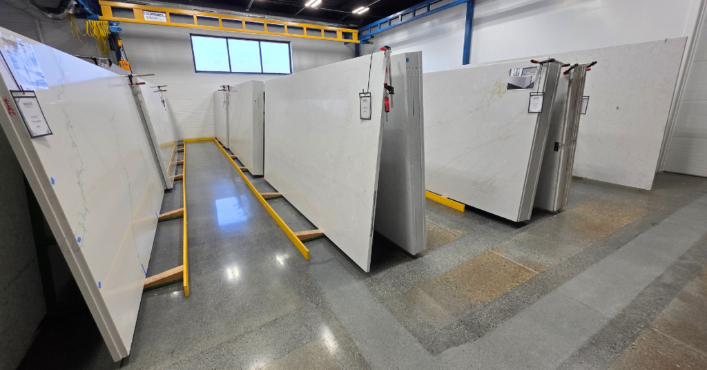
Photos can only tell you so much. The real differences between these ten shades, the way the veining moves, how the sparkle catches the light, how warm or cool a white actually reads, only become clear when you’re standing in front of a full slab.
At Masters Countertops in Wheeling, IL, we keep all of these shades on display so you can compare them side by side, bring your own cabinet samples, and see exactly how each one will look in your space before you commit. Stop by our showroom or request a free quote to get started.
Financing Made Simple
A beautiful countertop shouldn’t have to wait for the “right” time in your budget. That’s why Masters Countertops offers flexible financing with 0% APR options available for up to 6 months for qualifying customers.
Checking your options takes just a few minutes and uses a soft credit check, so there’s no impact on your credit score just for looking. You can see an estimated monthly payment using our online calculator or get a personalized number through our Instant Quote tool before you ever set foot in the showroom.
Whether you’re working with a tight timeline or just prefer to spread the cost out, financing makes it easier to get the kitchen or bathroom you’ve been picturing — without putting your other plans on hold. Get your instant quote to see what your monthly payment could look like.
Like what you see? Follow us for more design inspiration, expert tips, and the latest trends in natural stone and quartz countertops. Don’t forget to share!